50 More Beautifully Designed Tumblr Themes
Way back in 2009 we posted a collection of 30 Beautifully Designed Tumblr Themes. Back then the Tumblr library of themes was much smaller than it is today and in light of the huge growth in the platform as a whole we decided to bring you fifty more themes perfect for anyone with a designer’s eye.
This time we’ve switched things up by not only featuring a ton of great free themes, but an additional selection of premium themes for anyone who needs to go that extra mile. Let’s take a look!
2 Million+ Tumblr Themes, Web Templates & More With Unlimited Downloads
Download thousands of Tumblr themes and templates with a monthly Envato Elements membership. It starts at $16 per month, and gives you unlimited access to a growing library of over 2,000,000 Tumblr themes, templates, fonts, photos, graphics, and more.
Free Themes
Tumblr has always stood out to me as one of the only blogging platforms around with truly stunning free themes. If you’re a designer, the first time you see Tumblr will likely be the last time you look at Blogger!
The collection below is a good representation of the different types of theme design you’ll find across the Tumblr library. I tried to find each little niche and pick out the best looking theme within. However, a few of the themes below are completely out on their own and definitely aren’t weighed down by pre-established norms.
Ava-May
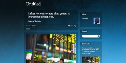
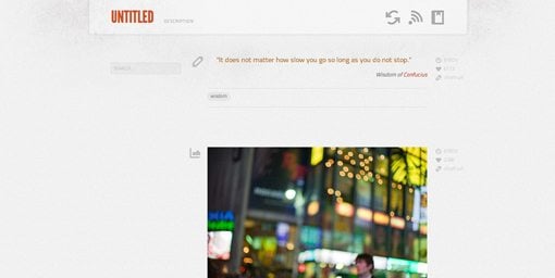
A nice wide content area with a subtle texture background. I really like the layered header, it’s simple but quite attractive.
Grotesk
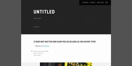
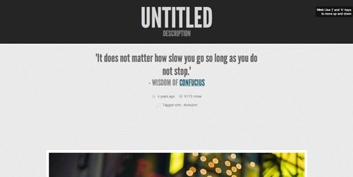
This one is super classy. There’s lots of contrast to draw the eye in and the generous use of whitespace works well with the condensed uppercase typography. If you’re looking for a clean and minimal yet masculine theme, look no further.
Mellow Yellow
Just like Grotesk, Mellow Yellow uses a condensed uppercase font, but that’s where the similarities end. Here the background is bold and bright with some random scattered dots and each post contains a bold corner treatment.
The Eames
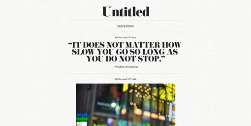
I really liked the typography on this theme. The font is old style with large serifs and lots of contrast between the thicks and thins. It makes for some really attractive headlines.
Floaty
Floaty has a really nice color scheme and layout with lots of nice subtle touches. The background is the element that steals the show though, a large abstract watercolor that almost feels like the reflection of a cloudy sky.
Black Diamonds
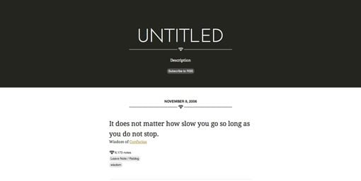
Black diamonds is another theme that just feels classy. Most of the page is fairly average but the dark header is a really nice touch.
Inkhorn
Inkhorn definitely has an old school printed feel and contains an efficient two column layout while still keeping the overall content width fairly narrow. One nice touch is the “back to top” button that sits near the bottom and stays with you as you scroll.
Pink Touch 2
Pink Touch 2 has really a really stellar mic of color and texture. The background texture is subtle but adds a lot to the overall design, as do the little 3D banners that wraparound each post.
Revista
Sometimes it’s great to break the mold of linear thinking and a grid of content is one of the most logical and organized ways to do that. This is one of the better free grid templates out there so be sure to check it out!
Glacial simplicity
The design of this one is very similar to Pink Touch above: the slightly textured background and pointy patterned header. However, while Pink Touch is definitely a feminine theme, this brings the same ideas with a more masculine gray-driven color scheme.
Sarah’s Theme
The stripes on this one are admittedly a bit on the busy side, but they do make for an attractive page that really stands out as unique in this list. I also really like the frame treatment on the images.
Diaphanous Theme v1.4
This theme combines lots of transparency effects with stone textured background. The effect is a light, airy feel perfect for the casual blogger.
(More) Important Things
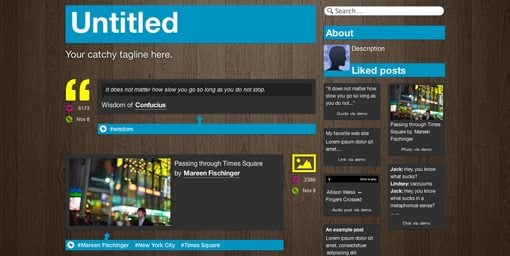
Many of the free themes with a wooden background can be quite hideous, this is one of the better attempts. The large patches of blue really stand out against the wood and help both the aesthetics and the readability.
Last Stand of Stupidity
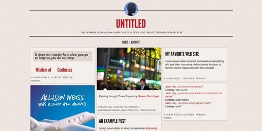
Here’s another grid-based theme but this time the layout is much more organic due to the variable height of each block of content. The content blocks have rounded corners and the page is topped off with a unique header design.
Boston Polaroid
The header and typography on this theme are super simple but also quite stunning. The biggest thing going for this theme is the increased page width, which makes for huge photos. If you’re a photographer, you’ll definitely want to check out this theme.
Callisto
Great choice of fonts, a nice color scheme, an attractive texture; this theme has a lot going for it. My favorite design element though is the letterpress icons scattered throughout.
Stacky
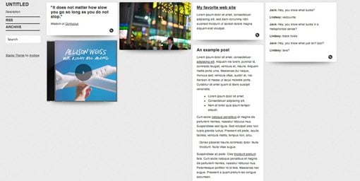
Another variation on the organic stack idea. This one has a much more horizontal layout and some nice shadow effects that really set the content out from the background.
Brutal Simplicity
Brutal Simplicity is exactly what the name implies, but in a good way! The thick bars with subtle gradients at the top of each post are a very Mac-like touch.
Royal Cameleon
Out of all the themes that I looked at, this one felt completely unique in its design and layout. The colors and texture give it a retro feel but in a way that isn’t cliche or overused.
Pressed
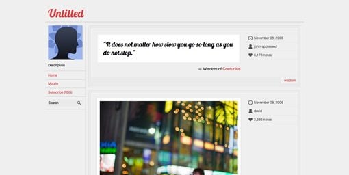
As the name implies, this one is all about the letterpressed borders that adorn each post. The use of the cursive Lobster font here clashes a bit with the clean and technical design, but it’s still a really nice looking page.
Mint
If you’re looking for something that is super clean without being boring, check out Mint. The plain but attractive background keeps your interest and the layout is a solid centered column with some nice contrasting tones.
Shining
Shining is one crazy and random theme. Each post has some random background texture that doesn’t look anything like the one before it. The randomness somehow comes together though and makes for a great looking blog.
Palmatum
The tree image on the left makes for a strong and simple graphic that adds contrast, visual interest and personality to an otherwise simple and efficient theme.
Royal Ribbon
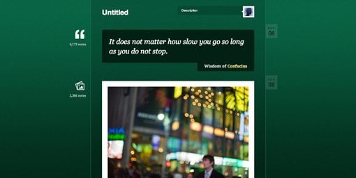
I really love this theme. The typography is stellar, the colors and texture are perfect and the icons are in an interesting round setting with multiple borders. Both the header and the footer finish off the design nicely with their own unique touches. If you’re a designer, this theme might appeal to you.
Not Bright
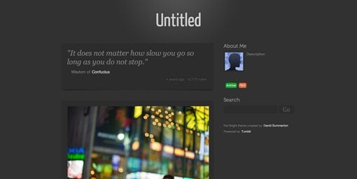
Sometimes you can’t beat a simple, dark gray radial gradient as a background. This one pulls off the technique nicely and stays very subdued with the post background color varying only slightly from that of the page.
Grey Daze
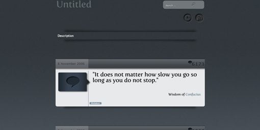
This one is another dark theme, but it’s much more quirky than the subdued nature of the previous theme. The post styling and icons are fairly unique, be sure to stop by and see the full-size preview.
Modern5
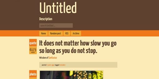
I love the colors on this theme. Despite being called “Modern”, to me it feels straight from the 70s. Everything has a slightly oversized feel to it as well, which really increases the aesthetic impact.
Blue Heron
Blue Heron has a fairly unique layout that utilizes a narrow content area and comparatively wide sidebar. The hard shadow effect and interesting background make for a great-looking page.
Cheshire
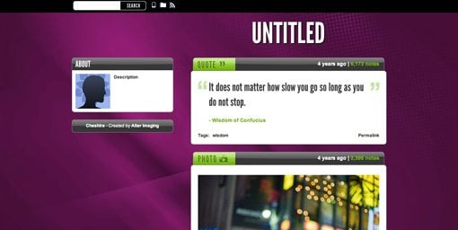
Cheshire is a crazy looking theme that sort of strikes me as the 90s meets web 2.0. I really like the little tabs that stick off the top of each post.
Nightnight
If you’re looking for a dead simple theme with almost zero fluff, check out Nightnight. The dark colors make for a serious and dramatic presentation of content, balanced out by the thin and light typography.
Olde Songs That You Love
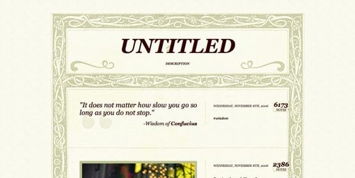
You can’t miss the impressive border treatment on this theme. It reminds me of something you’d see in an old illustrated children’s book. If you want something that will really strike your visitors as unique, try this one.
Postage
Every good theme collection must have at least one design inspired by the mail, and this collection is no exception. Postage uses many familiar design elements to this genre and looks simply fantastic.
Vanilla Pod
Vanilla Pod is another of my favorites because it’s has a visual style that’s all its own. I like the button post badges and the almost completely transparent post backgrounds.
Stargazer
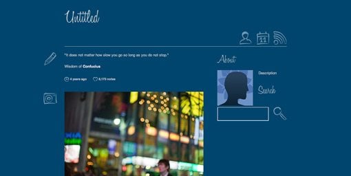
The handwritten script font and scribbled icons give this theme a homemade vibe that’s perfect for all you artsy types out there that don’t want to run for the cliche scrapbook feel.
Premium Themes
If you didn’t find anything that suits your needs in the free themes above, it might be time to start looking in the premium arena. Premium Tumblr themes are quite affordable and tend to offer a lot more in both aesthetics and features.
Time Goes Back: A Tumblr Portfolio Theme
This is a gorgeous theme with a grid format to display your portfolio pieces and topped with an iPad visual. Everything from the type down to the hover effects is just perfect for a professional designer’s page.
Price: $20
Cream – A Tumblr Theme
“Cream is a clean and simple Tumblr theme using subtle textures and colors for a light and playful feel. Main colors are creamy tones of beige and tan, accented with pinks for links and accent items.”
Price: $20
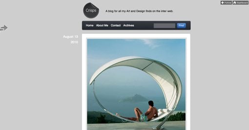
Crisps Tumblr Theme
“This is a clean, minimal and easily customisable theme for Tumblr with a jQuery sliding sidebar for showing who you follow and stuff you like.”
Price: $20
MARS
A visually busy but attractive theme with a rock background, plenty of room for content and a really cool stacking effect with the post badges.
Price: $49
Contrast
A nice unified design with a frame that ties all of the various elements together. The three column format makes for plenty of room for content and social media integration is built right in.
Price: $49
Vintage Scrapbook
Scrapbook themes are easy to screw up and turn into something messy and/or ugly, this one looks great though and has a lot of attention to detail. There are plenty of nice touches, including page curls and little staples.
Price: $49
Carbon
This beautiful theme features a fixed sidebar and great use of texture. The sidebar features links for Facebook, Twitter, Flickr and email and more.
Price: $49
Fluid 2
The original Fluid continues to be one of the most popular Tumblr themes around and this sequel attempts to relive that success. The background is a really attractive spectrum, the content area is super wide and the post icons are awesome.
Price: $49
Paris Nights
If you’re looking for a travel theme, Paris Nights is a beautiful option complete with a string of lights and various postcards scattered around and poking out from behind the content.
Price: $49
Marber
Marber is clean and professional with a sort of notepad feel without the cheesiness that normally comes with that idea.
Price: $49
Savory
Savory utilizes lots of texture and layering to create a rich theme with plenty of realism. The two columns are perfectly proportioned and contain plenty of useful features.
Price: $49
Which Theme Do You Use?
Tumblr is an amazing platform driven by a ton of super talented theme designers. With hundreds and hundreds of options to choose from, the aim of this post was to narrow the selection down a bit so you only have to sift through the truly stellar themes that stand out from the rest in terms of design.
Leave a comment below and let us know which theme you currently have installed and why. Feel free to leave a link to your Tumblr blog so we can take a look!


