How to Design a Presentation for Screen Viewing
Given how the world is changing, you are probably presenting more commonly on screens in virtual conference or webinar settings. That can impact the design of presentations, and you’ll need to think about what to change to make it work well.
There are multiple considerations when designing PowerPoint, Keynote or Google Slides templates for screen viewing versus when you are presenting live.
Here, we’ll walk through key considerations to help you make the most of designing presentations for screen viewing.
How Does Unlimited PowerPoint Templates Sound?
Download thousands of PowerPoint templates, and many other design elements, with a monthly Envato Elements membership. It starts at $16 per month, and gives you unlimited access to a growing library of over 2,000,000 presentation templates, fonts, photos, graphics, and more.
Consider Screen Size
Viewers in virtual or webinar style presentations may use a lot of different device types or sizes when watching your presentation. This makes it important to consider how people will engage with the presentation.
Set up the presentation in a common format. Most presentation software uses a 16:9 aspect ratio. This should suffice for most presentations. While some people might log in using a phone, this size works for turning it sideways to view and also works on desktops and tablets.
What might be more important to think about when it comes to screen size is that webinar viewing and multitasking are commonplace. That means slides might get pushed to the background during playback or may be minimized on the screen.
Key takeaway: Create a design for each slide that’s readable at a small size.
Leave a Video Location

Most webinar or online presentation formats include live video of the speaker. (Some might include video with a panel of speakers.
Depending on the delivery tool – Zoom, GoToMeeting, Microsoft Teams, etc. – the positioning of where video appears on the screen can differ. Think about this position or placement (particularly if you are recording the presentation) and leave a blank space somewhere on each slide – preferably in the same location – to put the video feed block.
For most slides and presentations, the best locations are the top or bottom right corner.
Key takeaway: You need to design a “hole” on each slide for a video block.
Think About Screen Contrast
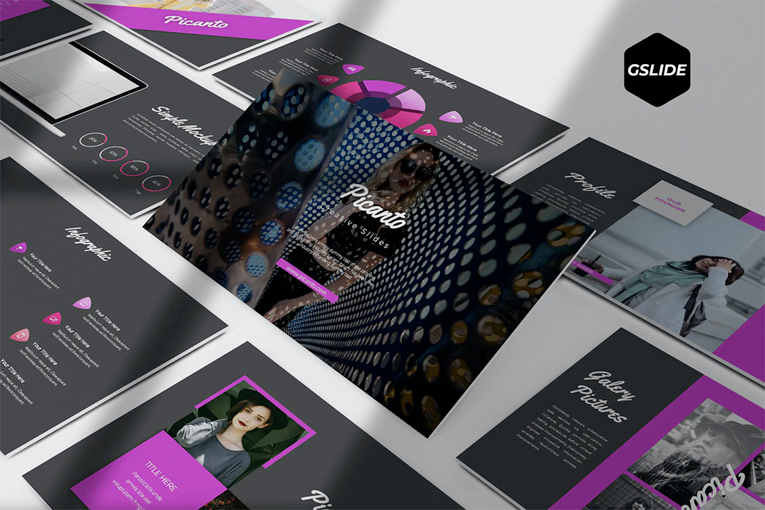
Designing for screens comes with different considerations for color contrast.
When designing a presentation for a live environment, you might use a different color scheme than on a screen. What looks good to you when working on a computer? Do you prefer light or dark mode?
Use that as you create slides. A pure white background can come across as harsh. A soft gray may be more appealing.
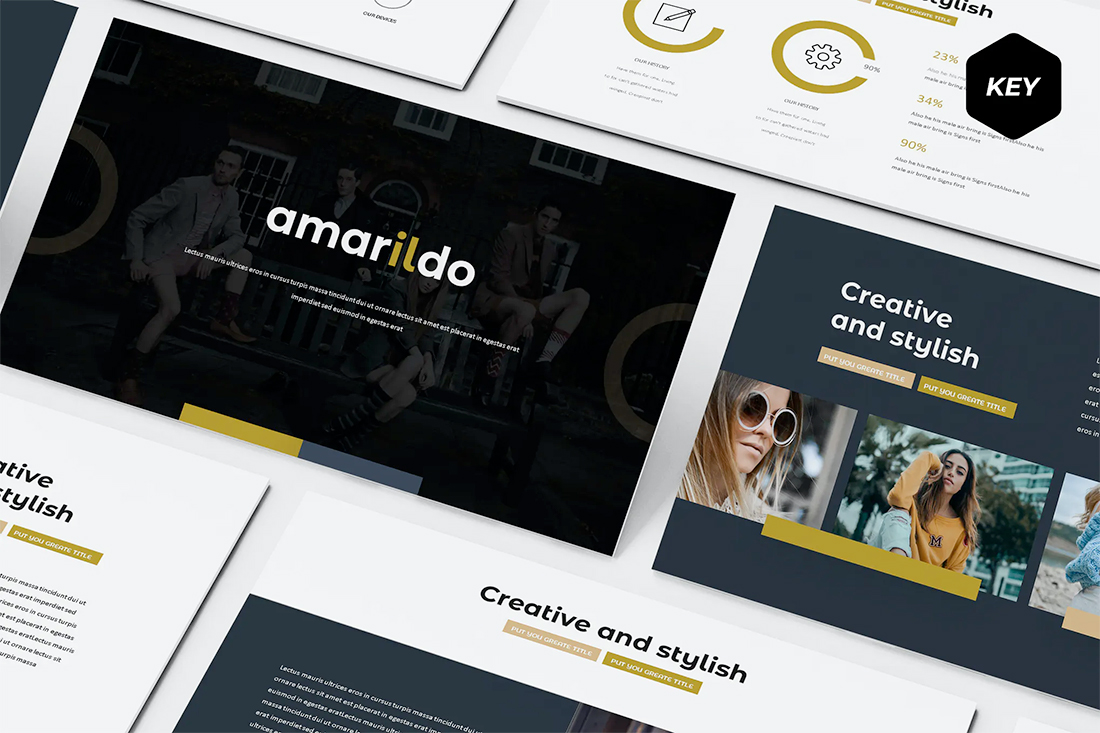
A “dark mode” visual might work well for online presentations. It’s not a format commonly used in live presentations because of readability issues. But with a simple solid, dark colored background and light text elements with thicker strokes, it can work well for screen viewing.
As dark mode grows in popularity, it’s less of a shock to viewers as well. Dark interfaces are rapidly becoming commonplace.
Key takeaway: Designing presentations for screens provides a good opportunity to try a “dark mode” aesthetic.
Video Playback and Recording
Do you plan on creating a recording of your presentation for later playback (or your portfolio)?
If so, you’ll want to set up elements on the screen to facilitate a better playback experience.
Considerations:
- Leave a place on the screen – often within slides – for the video screen box.
- Use presentation or full slide mode so the recording fills the frame.
- Place all elements (such as the video box) where you want them to be on screen before you start recording.
- Use a verbal countdown so that participants know when the recording is about to start.
Key takeaway: You should plan for placement of elements on screen for recordings.
Take Care with Text
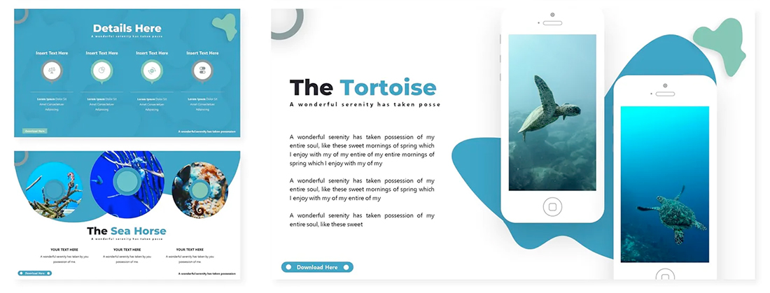
We’ve all sat through presentations that have way too much text on the slides. It can make presentations seem to drone on forever.
But in a virtual or webinar-style format, providing information in this manner can actually be OK.
It’s harder to read your audience when you can’t see them. Having key points clearly explained on the screen can aid viewer comprehension. This is important when you can’t tell from looking at people if they need more information or emphasis on a key point.
What you are likely to find is that slides are a lot heavier with text than you are used to. And that’s ok.
The happy middle ground might be that presentations actually include more slides – the motion can keep users engaged – with a mix of visual versus text-heavy slides. Show anything that you can with images and graphics; explain the rest with text.
Key takeaway: Presentation design for screens will likely include a lot more text than slides for in-person audiences.
Clean Up Your Notes
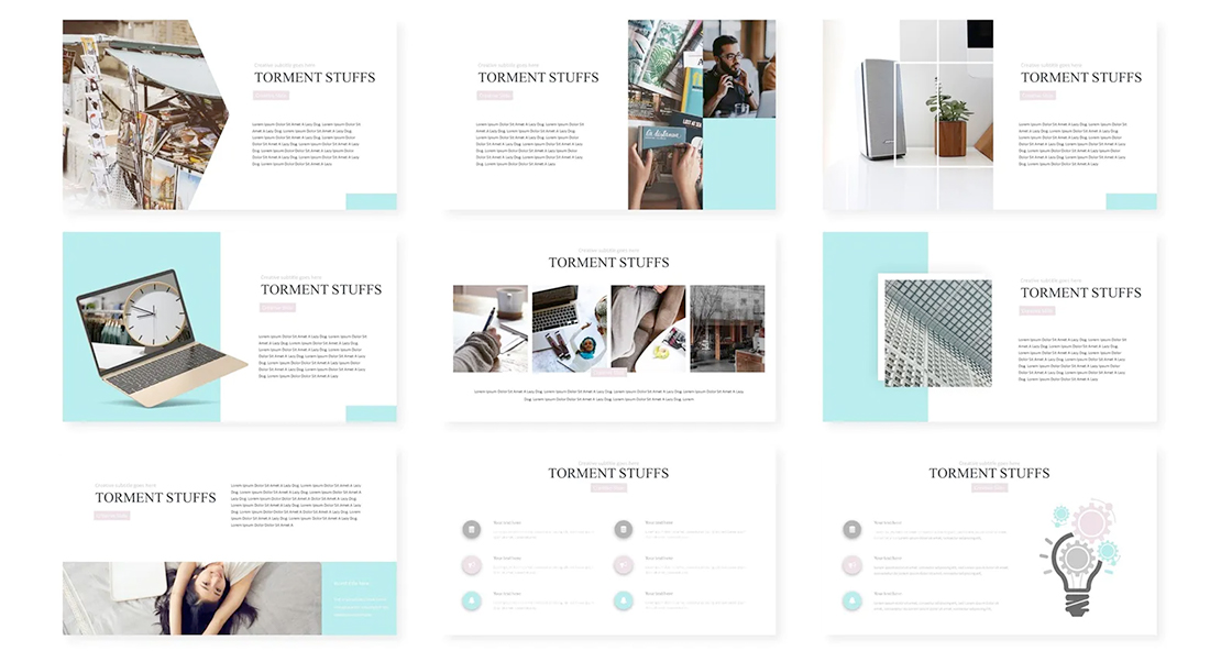
The idea of text heavy-slides brings up the next point naturally. Do you plan to share slides after the presentation?
For many webinars, the answer is yes. Slides or recordings are sent to registered participants after the event.
If slides contain notes, clean them up. They should read without errors and match screen content. Use notes to jot down a script or key talking points you don’t want to forget, but avoid sending your script to participants.
A better option is to go note-free. Don’t expect participants to glean information from your notes, put everything they need to know on an actual slide.
Key takeaway: The notes feature for screen-based presentations is just for the presenter, not the audience.
Compress Everything for Sharing
Slide decks for online presentations can get large quickly. For an hour-long presentation, you may end up with upward of 60 slides.
Sending out files of that size can get tricky. Before sending the presentation deck, compress everything to a more manageable size, upload the file and send a download link, or convert slides into a PDF for easy file management.
The latter might be the most efficient way of handling presentations for sending out after an online event. (It also makes it a lot harder to “steal” slides for reuse elsewhere.)
Key takeaway: Smaller file sizes are easier to share and send. A download link will provide you with information about how many people nabbed the file post-event.
Bonus: Tips to Nail a Virtual Presentation
A beautiful presentation isn’t enough when you are presenting virtually. You also have to nail the delivery.
Five tips to make your presentation a success:
- Write a script and rehearse it. You should sound like you know what you are talking about without fumbling and finish in the allotted time. The trick is to know the material well enough that you don’t sound like you are reading (or look like it if you are showing live video).
- Turn your camera on – and leave it on. Viewers like to see the presenter. Engagement rates for online presentations are higher when the presenter is visible.
- Pay attention to outside noise or visuals that can be distracting to the audience. Dogs barking or spouses walking in during the presentation are a no-no.
- Have a technical backup. The most seamless online presentations have more than one person working behind the scenes. If you are talking to the audience, someone else should be monitoring questions, running polls, or letting people into meeting rooms.
- Use high-definition settings and video. It takes more bandwidth, but the overall presentation will appear so much more professional and polished.
- Get dressed “for work” before giving a presentation. Yes, everything is more casual with so many people on video calls all day, but you should look the part of a pro when giving a talk to an audience.
Conclusion
Giving an online presentation can be hard. But it can also be a fun design challenge.
You can try new things with presentation design that might be a little outside of your comfort zone. And experiment with the audience. Use post-presentation surveys and feedback to gather information on slide and presentation design. Your audience knows best what they want to see; ask for that feedback and use it in future designs.
