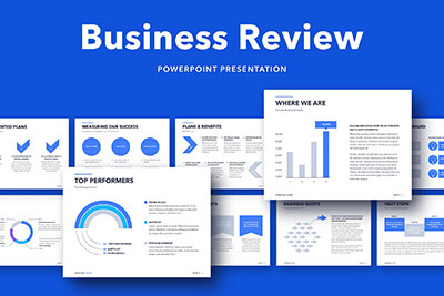
30 Presentation Terms & What They Mean
Delivering a captivating presentation is an art that requires more than just confidence and oratory skills. From the design of your slides to the way you carry yourself on stage, every little detail contributes to the overall effectiveness of your presentation. For those who wish to master this art, getting familiar with the associated terminology is a great place to start.
In this article, we’ll explore “30 Presentation Terms & What They Mean,” shedding light on the key terms and concepts in the world of presentations. Whether you’re a professional looking to refine your skills, a student aiming to ace your next presentation, or just someone curious about the subject, this guide is sure to provide you with valuable insights.
Dive in as we explore everything from slide decks and speaker notes to body language and Q&A sessions.
Each term is elaborated in depth, giving you a comprehensive understanding of their meanings and applications. This knowledge will not only make you more comfortable with presentations but will also empower you to deliver them more effectively.
2 Million+ PowerPoint Templates, Themes, Graphics + More
Download thousands of PowerPoint templates, and many other design elements, with a monthly Envato Elements membership. It starts at $16 per month, and gives you unlimited access to a growing library of over 2,000,000 presentation templates, fonts, photos, graphics, and more.
Table of Contents
- Slide Deck
- Speaker Notes
- Template
- Transition
- Animation
- Multimedia
- White Space
- Aspect Ratio
- Grid System
- Master Slide
- Handouts
- Infographic
- Data Visualization
- Call-to-Action (CTA)
- Kerning
- Typography
- Color Palette
- Contrast
- Harmony
- Negative Space
- Storyboarding
- Bullet Points
- Hook
- Gestures
- Eye Contact
- Body Language
- Rehearsal
- Props
- Q&A Session
- Feedback
1. Slide Deck
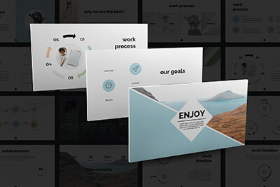
A slide deck, in its most basic sense, is a collection of slides that are presented in sequence to support a speech or presentation. The slides typically contain key points, graphics, and other visual aids that make the presentation more engaging and easier to understand.
Beyond merely displaying information, a well-crafted slide deck can tell a story, create an emotional connection, or illustrate complex concepts in a digestible way. Its design elements, including the choice of colors, fonts, and images, play a significant role in how the presentation is received by the audience.
2. Speaker Notes
Speaker notes are a feature in presentation software that allows presenters to add notes or cues to their slides. These notes are only visible to the presenter during the presentation. They can include additional information, reminders, prompts, or even the full script of the speech.
While the audience sees the slide deck, the speaker can use these notes as a guide to ensure they cover all necessary points without memorizing the entire speech. It’s essential to use speaker notes strategically – they should aid the presentation, not become a script that hinders natural delivery.
3. Template
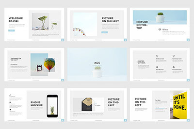
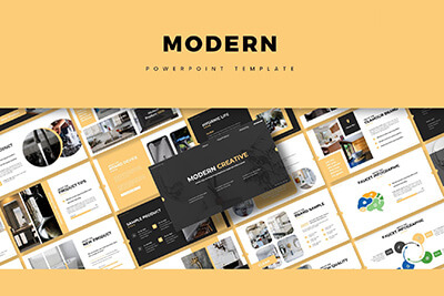
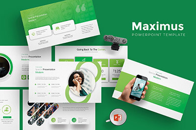
A template is a pre-designed layout for a slide deck. It typically includes a set design, color scheme, typefaces, and placeholders for content like text, images, and graphs. Templates can significantly reduce the time and effort required to create a professional-looking presentation.
While templates can be incredibly helpful, it’s important to choose one that aligns with the theme, purpose, and audience of the presentation. Customizing the template to match your brand or topic can further enhance its effectiveness.
4. Transition
In the realm of presentations, a transition refers to the visual effect that occurs when you move from one slide to the next. Simple transitions include fade-ins and fade-outs, while more complex ones might involve 3D effects, wipes, or spins.
Transitions can add a touch of professionalism and dynamism to a presentation when used correctly. However, overuse or choosing flashy transitions can be distracting and detract from the content. The key is to use transitions that complement the presentation’s tone and pace without overshadowing the message.
5. Animation
Animation is the process of making objects or text in your slide deck appear to move. This can involve anything from making bullet points appear one by one, to having graphics fly in or out, to creating a simulation of a complex process. Animation can add interest, emphasize points, and guide the audience’s attention throughout the presentation.
While animations can make a presentation more engaging, they must be used judiciously. Excessive or overly complex animations can distract the audience, complicate the message, and look unprofessional. As with transitions, animations should support the content, not detract from it.
6. Multimedia
Multimedia refers to the combination of different types of media — such as text, images, audio, video, and animation — within a single presentation. Incorporating multimedia elements can make a presentation more engaging, cater to different learning styles, and aid in explaining complex ideas.
However, it’s important to ensure that multimedia elements are relevant, high-quality, and appropriately scaled for the presentation. Additionally, depending on the presentation venue, technical considerations such as file sizes, internet speed, and audio quality need to be taken into account when using multimedia.
7. White Space
In the context of presentation design, white space (or negative space) refers to the unmarked portions of a slide, which are free of text, images, or other visual elements. Despite its name, white space doesn’t necessarily have to be white — it’s any area of a slide not filled with content.
White space can give a slide a clean, balanced look and can help draw attention to the most important elements. It can also reduce cognitive load, making it easier for the audience to process information. Good use of white space is often a key difference between professional and amateur designs.
8. Aspect Ratio
Aspect ratio is the proportional relationship between a slide’s width and height. It’s typically expressed as two numbers separated by a colon, such as 4:3 or 16:9. The first number represents the width, and the second represents the height.
The choice of aspect ratio can affect how content fits on the screen and how the presentation appears on different displays. For instance, a 16:9 aspect ratio is often used for widescreen displays, while a 4:3 ratio may be more suitable for traditional computer monitors and projectors.
9. Grid System
The grid system is a framework used to align and layout design elements in a slide. It’s comprised of horizontal and vertical lines that divide the slide into equal sections or grids.
The grid system aids in creating visual harmony, balance, and consistency across slides. It can guide the placement of text, images, and other elements, ensuring that they’re evenly spaced and aligned. It’s an important tool for maintaining a professional and organized appearance in a presentation.
10. Readability
Readability refers to how easy it is for an audience to read and understand the text on your slides. It involves factors such as font size, typeface, line length, spacing, and contrast with the background.
Ensuring good readability is crucial in presentations. If your audience can’t easily read and understand your text, they’ll be more likely to disengage. Large fonts, simple language, high-contrast color schemes, and ample white space can enhance readability.
11. Infographic
An infographic is a visual representation of information, data, or knowledge. They’re used in presentations to communicate complex data in a clear, concise, and engaging way. Infographics can include charts, graphs, icons, pictures, and text.
While infographics can effectively communicate complex ideas, they must be designed carefully. Too much information, confusing visuals, or a lack of a clear hierarchy can make an infographic difficult to understand. It’s important to keep the design simple and focus on the key message.
12. Embed
To embed in a presentation context means to incorporate external content, such as a video, a document, or a website, directly into a slide. When an object is embedded, it becomes part of the presentation file and can be viewed or played without leaving the presentation.
Embedding can be a useful tool to incorporate interactive or supplementary content into a presentation. However, it’s important to remember that it can increase the file size of the presentation and may require an internet connection or specific software to function correctly.
13. Palette
A palette, in terms of presentations, refers to the set of colors chosen to be used throughout the slide deck. This can include primary colors for backgrounds and text, as well as secondary colors for accents and highlights.
The right color palette can help convey the mood of a presentation, reinforce branding, and increase visual interest. It’s important to choose colors that work well together and provide enough contrast for readability. Tools like color wheel or color scheme generators can be helpful in choosing a harmonious palette.
14. Vector Graphics
Vector graphics are digital images created using mathematical formulas rather than pixels. This means they can be scaled up or down without losing quality, making them ideal for presentations that may be viewed on different screen sizes.
Vector graphics often have smaller file sizes than their pixel-based counterparts (raster graphics), which can help keep your presentation file manageable. Common types of vector graphics include logos, icons, and illustrations.
15. Mood Board
A mood board is a collection of images, text, colors, and other design elements that serve as visual inspiration for a presentation. It helps establish the aesthetic, mood, or theme of the presentation before the design process begins.
Creating a mood board can be a valuable step in the presentation design process. It can help you visualize how different elements will work together, communicate your design ideas to others, and maintain consistency across your slides.
16. Hierarchy
In design, hierarchy refers to the arrangement of elements in a way that implies importance. In presentations, visual hierarchy helps guide the viewer’s eye to the most important elements first.
Hierarchy can be created through the use of size, color, contrast, alignment, and whitespace. Effective use of hierarchy can make your slides easier to understand and keep your audience focused on the key points.
17. Stock Photos
Stock photos are professionally taken photographs that are bought and sold on a royalty-free basis. They can be used in presentations to add visual interest, convey emotions, or illustrate specific concepts.
While stock photos can enhance a presentation, it’s important to use them judiciously and choose images that align with your presentation’s tone and content. Overuse of generic or irrelevant stock photos can make a presentation feel impersonal or unprofessional.
18. Sans Serif
Sans serif refers to a category of typefaces that do not have small lines or strokes attached to the ends of larger strokes. Sans serif fonts are often used in presentations because they’re typically easier to read on screens than serif fonts, which have these small lines.
Some popular sans serif fonts for presentations include Helvetica, Arial, and Calibri. When choosing a font for your slides, readability should be a primary consideration.
19. Hyperlink
A hyperlink, or link, is a clickable element in a slide that directs the viewer to another slide in the deck, a different document, or a web page. Hyperlinks can be used in presentations to provide additional information or to navigate to specific slides.
While hyperlinks can be useful, they should be used sparingly and appropriately. Links that direct the viewer away from the presentation can be distracting and disrupt the flow of your talk.
20. PDF
PDF stands for Portable Document Format. It’s a file format that preserves the fonts, images, graphics, and layout of any source document, regardless of the computer or software used to create it. Presentations are often saved and shared as PDFs to ensure they look the same on any device.
While a PDF version of your presentation will maintain its appearance, it won’t include interactive elements like animations, transitions, and hyperlinks. Therefore, it’s best used for distributing slide handouts or when the presentation software used to create the deck isn’t available.
21. Raster Graphics
Raster graphics are digital images composed of individual pixels. These pixels, each a single point with its own color, come together to form the full image. Photographs are the most common type of raster graphics.
While raster graphics can provide detailed and vibrant images, they don’t scale well. Enlarging a raster image can lead to pixelation, where the individual pixels become visible and the image appears blurry. For this reason, raster images in presentations should be used at their original size or smaller.
22. Typeface
A typeface, often referred to as a font, is a set of characters with the same design. This includes letters, numbers, punctuation marks, and sometimes symbols. Typefaces can have different styles and weights, such as bold or italic.
The choice of typeface can significantly impact the readability and mood of a presentation. For example, serif typefaces can convey tradition and authority, while sans serif typefaces can appear modern and clean. The key is to choose a typeface that aligns with the purpose and audience of your presentation.
23. Visual Content
Visual content refers to the graphics, images, charts, infographics, animations, and other non-text elements in a presentation. These elements can help capture the audience’s attention, enhance understanding, and make the presentation more memorable.
While visual content can enhance a presentation, it’s important not to overload slides with too many visual elements, as this can confuse or overwhelm the audience. All visual content should be relevant, clear, and support the overall message of the presentation.
24. Call to Action
A call to action (CTA) in a presentation is a prompt that encourages the audience to take a specific action. This could be anything from visiting a website, signing up for a newsletter, participating in a discussion, or implementing a suggested strategy.
A strong CTA aligns with the goals of the presentation and is clear and compelling. It often comes at the end of the presentation, providing the audience with a next step or a way to apply what they’ve learned.
25. Thumbnails
In presentations, thumbnails are small versions of the slides that are used to navigate through the deck during the design process. They provide an overview of the presentation’s flow and can help identify inconsistencies in design.
Thumbnails are typically displayed in the sidebar of presentation software. They allow you to easily move, delete, or duplicate slides, and can provide a visual check for overall consistency and flow.
26. Aspect Ratio
Aspect ratio is the proportional relationship between a slide’s width and height. It’s typically expressed as two numbers separated by a colon, such as 4:3 or 16:9. The first number represents the width, and the second represents the height.
The choice of aspect ratio can affect how content fits on the screen and how the presentation appears on different displays. For instance, a 16:9 aspect ratio is often used for widescreen displays, while a 4:3 ratio may be more suitable for traditional computer monitors and projectors.
27. Interactive Elements
Interactive elements are components in a presentation that the audience can interact with. These could include hyperlinks, embedded quizzes, interactive infographics, or multimedia elements like audio and video.
Interactive elements can make a presentation more engaging and memorable. However, they require careful planning and should always be tested before the presentation to ensure they work as intended.
28. Placeholders
In the context of presentations, placeholders are boxes that are included in a slide layout to hold specific types of content, such as text, images, or charts. They guide the placement of content and can help ensure consistency across slides.
Placeholders can be especially useful when working with templates, as they provide a predefined layout to follow. However, they should be used flexibly – not every placeholder needs to be used, and additional elements can be added if necessary.
29. Master Slide
The master slide is the top slide in a hierarchy of slides that stores information about the theme and slide layouts of a presentation. Changes made to the master slide, such as modifying the background, fonts, or color scheme, are applied to all other slides in the presentation.
Master slides can help ensure consistency across a presentation and save time when making global changes. However, it’s important to note that individual slides can still be modified independently if necessary.
30. Layout
In presentations, a layout refers to the arrangement of elements on a slide. This includes the placement of text, images, shapes, and other elements, as well as the use of space and alignment.
Choosing the right layout can make your slides look organized and professional, guide the viewer’s eye, and enhance your message. Most presentation software offers a variety of pre-defined layouts, but these can usually be modified to better suit your content and design preferences.
