The Geometric Design Trend: Patterns, Fonts, and More
One of the design styles that’s been gaining popularity is the use of geometric elements including patterns, geometric fonts, and other elements to create a design scheme. Often these patterns and elements are rather simplistic, but they can have complex elements as well.
Geometric shapes and elements can be used for almost any part of a design, from a hero element to the full aesthetic.
Here, we’ll take a look at this design trend, characteristics, and tips to help you use it well.
2 Million+ Digital Assets, With Unlimited Downloads
Get unlimited downloads of 2 million+ design resources, themes, templates, photos, graphics and more. Envato Elements starts at $16 per month, and is the best creative subscription we've ever seen.
About the Geometric Design Trend
Geometric design patterns seem to be everywhere. This trend is exemplified by the use of shapes throughout a design project. They can be repeating patterns, single or hap-hazardly placed shapes, fonts, or almost any use of circles, squares, triangles, or other shapes.
This design trend is popular because geometrics can be easy on the eyes and to work with. The construction of geometric patterns and shapes is familiar to most users and you don’t have to think too hard about the design elements or meaning.
These elements can include everything from shapes to lines and even extend to typefaces that include geometric letterforms.
Key Characteristics of Geometric Design
You’ll probably know designs in this style when you see them because they are fairly easy to identify. While geometric fonts are growing in popularity somewhat, patterns are a lot more popular.
Designers tend to use them either for repeating patterns or to create an overall background design element to create a focal point.
Here are some other things to look for in this design trend:
Repeating patterns
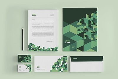
These patterns can be created using geometric shapes such as circles, squares, triangles, and hexagons, and often feature a symmetrical or tessellating design. These patterns can be used in a variety of ways, from background textures to foreground graphics.
Typography
Geometric fonts used in this style are often bold and simple, with clean lines and sharp angles. Sans-serif fonts are particularly popular, as they fit well with the clean and minimalist aesthetic of the trend. Google Fonts notes these popular fonts as having a geometric style: DM Sans, Poppins, Raleway.
Negative space
Often seen in the use of shapes that are cut out of a larger shape, leaving behind a void that creates visual contrast. Designers often create intentional negative space in this style, but that is not always the case.
Color
Geometric designs often include more minimalistic color options, with a focus on bold, primary colors, or monochromatic schemes. Pastels can also be used to create a softer mood.
Tips for Using Geometric Patterns
From small repeating patterns to more abstract geometric options, there are almost limitless possibilities for using this trend. To use it well, you’ll want to make sure every element is created with purpose and intention in relation to the rest of the content and design.
Some tips for using geometric patterns include:
- Keep it simple: Use a limited number of shapes and colors to create a clean and impactful pattern.
- Consider the context: Geometric patterns can be used in everything from branding to product packaging to website backgrounds. Consider the context in which your pattern will be used and adjust the scale, color, and shape accordingly. Don’t forget to adjust for responsiveness online either!
- Combine shapes: Put different shapes together to create new and different geometric combinations.
- Create impact with negative space: Use negative space to create contrast and balance in your pattern. Negative space can be the fun divot that helps keep users coming back or facilitates engagement if they “see” what’s been put in the space for them to find.
- Play with scale: Different scales of your geometric pattern will create different types of visual interest. Consider using a large-scale pattern as a background and a smaller-scale pattern as a foreground element.
- Mix and match: Don’t be afraid to mix and match different geometric patterns to create a unique and dynamic design. Try to maintain consistency in color and scale to keep the design cohesive.
- Use contrast to your advantage: Contrast is key in any design, and geometric patterns are no exception. Use contrasting colors, shapes, and scales to create visual interest and emphasis.
- Add color: Color is a powerful tool in design, and it can be used to create mood, evoke emotion, and convey meaning. Start with a brand color and expand the palette as needed to achieve the desired effect.
Tips for Using Geometric Fonts
Simple sans-serif geometric fonts can be pretty easy to use. But when you get into some more complex geometric fonts, readability can come into question. That makes it vital to think about usage and messaging when using these typefaces.
Some tips for using geometric fonts well include:
- Choose the right weight: Geometric fonts come in a variety of weights, from thin to bold. Choose a weight that works well with the size and scale of your design.
- Consider legibility: Geometric fonts can sometimes be difficult to read, especially when used in small sizes. Make sure that the font you choose is legible and easy to read, even when used in longer blocks of text.
- Pair with simple fonts: Geometric fonts often need to be paired with something that’s more simple to enhance reading comprehension. The funkier your geometric font, the more important this becomes.
- Use alignment and spacing: Geometric fonts often have uniform shapes and sizes, which can make them difficult to distinguish from one another. Use alignment and spacing to create visual separation and hierarchy between elements.
- Have fun with color: Geometric fonts can work well in a range of colors, from bold primaries to more muted tones. Experiment with different color schemes to find the one that works best for your design and helps you create just the right vibe for your project.
Other Considerations with the Geometric Design Trend
Geometric design elements can be used for more than patterns or fonts. The nice thing about geometric elements is they are versatile enough to work with almost any design scheme.
Some tips for using other geometric elements will include:
- Use one geometric element: Ditch the pattern and pick one geometric shape to use in the design. Don’t be afraid to go big for emphasis.
- Bring in animation: There’s no reason geometric elements have to be static. Create more dynamic elements with motion or animation to help generate greater user interest online.
- Use geometric shapes for gamification: Shapes can be a great element to aid in the understanding of a game-based element. (Think board games!) Use common shapes to help make gamified elements look easy to comprehend.
Conclusion
Overall, the geometric design trend is a versatile style that can be used in a variety of design projects, from branding to website design to product packaging. Clean lines, bold shapes, and a minimalist aesthetic make it a timeless and visually appealing choice.
It also has a classic quality that keeps this style from going out of fashion, because geometric design elements can work with almost anything else.
