Design Trend: Innovative Hover Effects
Everywhere you look, there’s a cool new animated effect. If animation was the must-have design element of 2016, then innovated hover effects are the up and coming design trend of 2017.
Thanks in part to the popularity of Material Design and Apple’s animation guidelines with a focus on small movements, hover effects are making a comeback. But instead of the tacky, flashing, bouncing and spinning effects of the past, animations are simple, sharp and delightful. The best hover effects help the user and enhance the experience.
Hover effects can range from motion that has an impact on the entire screen to something as small as a directional cue or navigation element.
2 Million+ Digital Assets, With Unlimited Downloads
Get unlimited downloads of 2 million+ design resources, themes, templates, photos, graphics and more. Envato Elements starts at $16 per month, and is the best creative subscription we've ever seen.
Home Page Movement
Hover effects can be a key part of your introductory user experience. With animation that fills the screen, additional hover effects can be quite charming.
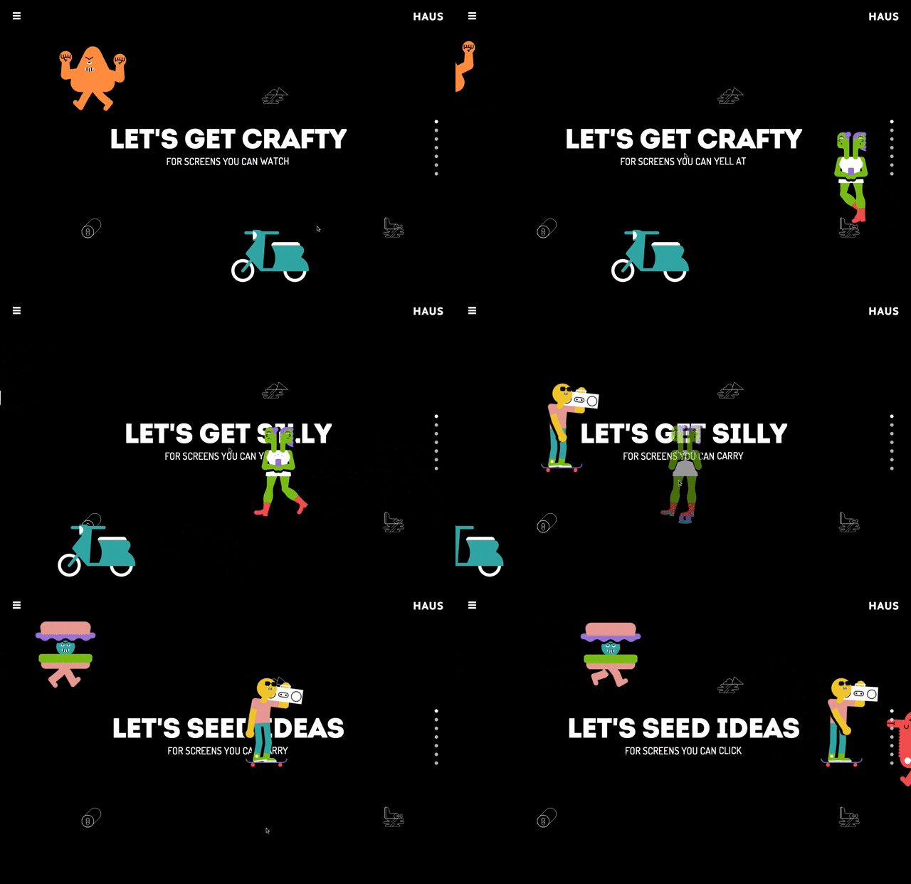
Haus, above, does an amazing job of this with cartoon characters that move across the screen. You might not think anything of the animation but with a hover, characters explode into another action. Without hover, each character just waltzes across the screen.
When working with a full-screen hover animation such as this, the trick is to delight users, not overwhelm them. That’s a pretty tricky middle ground. By keeping the rest of the design simple – dark, flat background with an easy to read sans serif typeface in white – the animation is allowed room. It is the one trick on the screen that encourages users to interact before they scroll to subsequent screens.
Button Effects
A simple animation can actually encourage a user to click or tap a button in the design. Seems simple, right?
That’s part of the reason this type of animation is so popular.
Design a button effect that helps users better understand the design for maximum impact. The example above from Luke Etheridge, shows a state that changes color and tells users what will happen with a click. This is a useful and functional hover animation that is functional and looks good.
Galleries and Slideshows
Webpages are packed with various galleries and slideshows. Almost all of these include multiple animated effects, from the movement between slides to arrows or other divots that tell users how to advance or go back.
The key to designing modern movements can be pulled right from Material Design specifications.
- Motion is quick
- Motion is clear
- Motion is cohesive
The motion is the shot from Baptiste Dumas does all of these things. The motion happens in a way that doesn’t leave the user asking what will happen next, it creates and obvious line between content elements and everything is tied together with similar and seamless flow of motion.
Navigation and Menus
Like it or not, hidden navigation styles are a popular design element. Great bits of animation or hover effects can help users better navigate content and move around the design.
From hamburger icons that grow or fade with information that pops up or swings out onto the screen, animating menu items can serve as a strong directional tool.
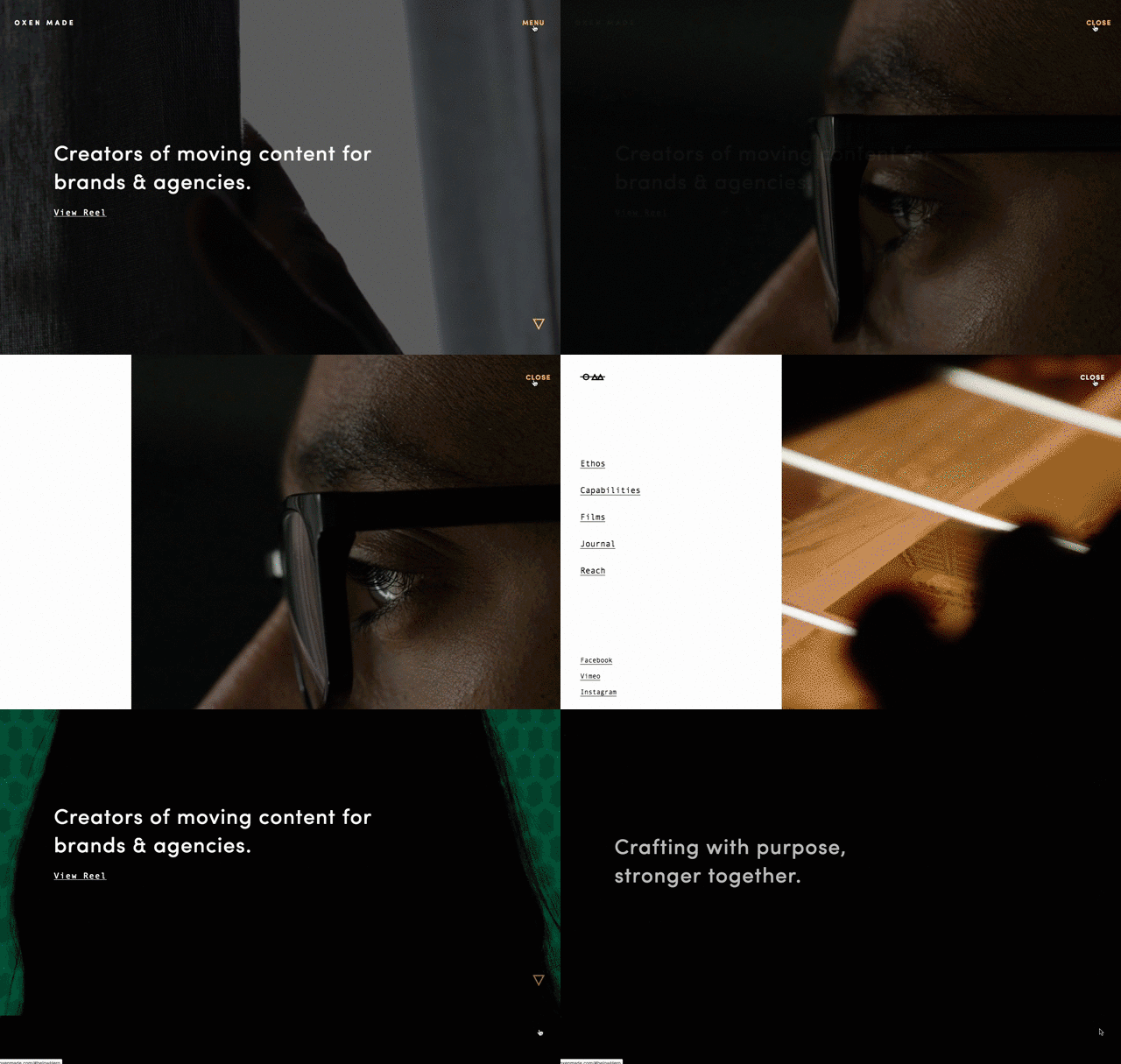
Oxen Made, above, uses hover animations in two ways on the home page to direct users to what actions they are supposed to take. “Menu” changes color on hover to let users know it is a clickable element. The full menu then swings out from the left side of the page. Further a small triangular arrow bounces in the right corner, using the same yellow from the active menu button, signaling that there’s more content on the scroll.
These subtle motions happen while a relatively busy background video plays. The softer motions contrast just enough with the background to grab the users’ attention and provide ample site direction and navigation.
Forms and Fields
Some of the best examples of hover effects are in use of forms and fields. Almost every website you visit is asking for some sort of action or information. The easier it is for users to provide this information, the more likely you are to actually collect it.
That doesn’t mean forms have to be boring. Visual cues such as tool tips that help users remember what to enter in a field (and in what format) as well as confirmation of success are important.
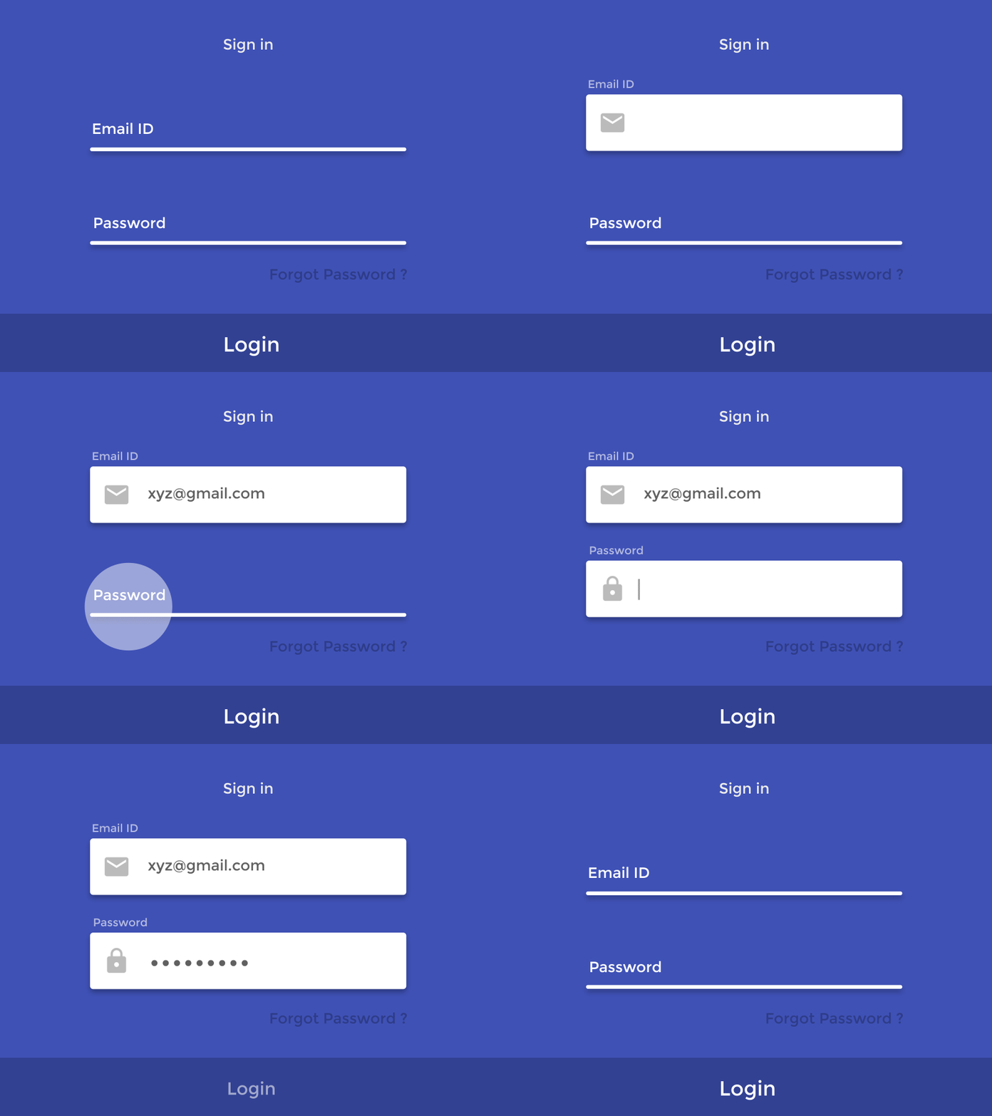
The example above does both things. Users are told what information to enter, they can see the entry as it happens and with a click on the “login” button a quick animated confirmation appears on the screen. Users don’t have to second-guess whether their information was entered correctly or not and know with that quick check on the screen that they can proceed with what they want to do next.
If you aren’t sure where to start with simple hover effects or animations, forms can be a good starting point. Users already expect this part of the website to be interactive. They are going to do something with the form; provide the appropriate feedback with a simple animation.
Resources and Code to Try
Ready to add some animated effects to your design? There are plenty of great resources that can help you get started.
- Hover.css: A collection of CSS3 powered hover effects to be applied to links, buttons, logos, SVG, featured images and so on. Apply to your elements, modify or use for inspiration. Available in CSS, Sass, and LESS.
- Image hover effects: A collection of effects to help you make the most of hover on images. Copy the code and use in your projects.
- Icon hover effects: Simple hover to add emphasis to circular icons.
- Amazing WordPress hover effects: The effects collection is great for WordPress users, and is made with pure CSS3 and no dependencies. The collection includes dozens of options and styles.
- W3Schools – CSS3 Transitions: Learn to use CSS3 transitions from the ground up with this tutorial.
Conclusion
Hover animations are one of those design techniques that look tricky and heavy. But the reality is that with CSS animation, almost anyone can add a simple animation with ease. They are lightweight and there are plenty of animators out there that want to share code snippets with you.
Just keep in mind the golden rule of using any trick in your design: It needs to be meaningful. Only use hover effects or animations when they add to the content; be careful not to distract users from the actions they need to take. Have fun and good luck!
