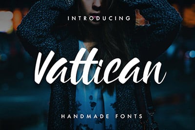
What Is a Descender in Typography?
In the world of typography, every curve, line, and stroke plays a critical role in crafting readable and visually appealing text. Among these nuanced elements are descenders, the elongated tails on certain lowercase letters that dip below the baseline.
In this quick guide, we explore descenders, their significance in design, and the impact they have on legibility, aesthetics, and spacing in typographic works. Whether you’re a seasoned designer or a typography enthusiast, understanding descenders can enhance your appreciation and application of text design.
Let’s dive in.
2 Million+ Fonts, Typefaces, and Design Resources With Unlimited Downloads
Download thousands of stunning premium fonts and typefaces with an Envato Elements membership. It starts at $16 per month, and gives you unlimited access to a growing library of over 2,000,000 fonts, design templates, themes, photos, and more.
What Is a Descender in Typography?

Descenders are the portions of lowercase letters, such as ‘g’, ‘j’, ‘p’, ‘q’, and ‘y’, that extends below the baseline of a font.
The baseline is the invisible line upon which most letters sit, and descenders drop beneath this line, adding depth and dimension to the text. In some typefaces, the letters ‘f’ and ‘z’ may also feature subtle descender elements, though this varies based on font design.
The Role of Descenders in Typography

(Source: Lauren Winters)
Descenders play a pivotal role in the readability and appearance of text. They contribute to the vertical rhythm of a line of type, helping to balance the visual weight and distribution of white space.
In handwriting and calligraphy, descenders allow for expressive flourishes, while in digital and print typography, they influence the overall texture and flow of paragraphs.
Impact on Design and Legibility
The design of descenders affects the legibility of text, particularly in dense blocks of type or smaller sizes. A well-proportioned descender can enhance the clarity of text by creating sufficient separation between lines, preventing letters from merging into one another.
Conversely, overly long or decorative descenders may disrupt readability, especially in contexts where space is limited.
Descenders and Type Design

(Source: Jim Kennelly)
Typeface designers meticulously craft descenders to reflect the style, tone, and purpose of the font. The length and shape of the descenders contribute to the font’s identity, with variations ranging from the strictly functional to the elegantly decorative.
You must balance aesthetic appeal with practicality, ensuring that the descenders serve the typeface’s intended application, whether for body text, headlines, or artistic compositions.
Choosing the Right Typeface
The choice of typeface significantly impacts the effectiveness of descenders in a given design project. Consideration of the typeface’s intended use, target audience, and medium is crucial.
For instance, typefaces intended for long-form reading typically feature more subdued descenders to maintain legibility, while display fonts may exhibit more pronounced and stylized descenders for decorative effect.
Adjusting Typography with Descenders in Mind
When working with typography, adjustments may be necessary to accommodate the specific characteristics of descenders. This includes tweaking line spacing (leading), kerning, and layout to ensure that text remains balanced and readable.
You might also consider the interplay between ascenders (the parts of letters that extend above the baseline) and descenders to create a harmonious vertical rhythm.
Best Practices for Typography Involving Descenders
Keep these tips in mind to make the most of descenders in typography design.
1. Ensure Adequate Line Spacing (Leading)
Adjust line spacing to create a comfortable reading experience, allowing descenders and ascenders from adjacent lines to coexist without visual interference. This not only enhances legibility but also contributes to a more aesthetically pleasing layout.
2. Consider Descenders in Layout Design
Incorporate the space required for descenders into your layout designs, particularly when dealing with tight spacing or grid systems. This consideration can prevent text from appearing cramped and can maintain the integrity of your design’s visual flow.
3. Pair Typefaces with Compatible Descender Lengths
When mixing typefaces, compare their descender lengths to ensure visual harmony. Disparate descender lengths can lead to a disjointed appearance, detracting from the cohesiveness of your design.
4. Use Descenders to Create Visual Interest
Leverage the unique shapes and lengths of descenders to add character and style to logos, headings, and special text elements. Well-chosen descenders can act as focal points, drawing the reader’s eye and adding personality to your designs.
5. Balance Descenders and Ascenders
Achieve typographic balance by considering both descenders and ascenders in your design. This balance affects not only the vertical rhythm but also the overall harmony of the text, contributing to a more polished and professional appearance.
6. Test Readability Across Mediums
Ensure that descenders do not compromise readability by testing your designs across different mediums, resolutions, and sizes. This is particularly important in responsive web design, where text must remain legible across a range of devices and screen sizes.
7. Be Mindful of Cultural and Linguistic Variations
When working with languages that use scripts with prominent descending elements, take into account cultural and linguistic nuances. The design and placement of descenders can vary significantly across languages, influencing how text should be balanced and spaced.
8. Optimize Descenders for Screen Readability
For digital designs, ensure that descenders are clear and distinguishable at lower resolutions. Screen readability can be affected by how well descenders are rendered, especially on devices with lower pixel densities.
9. Explore Creative Opportunities with Descenders
Descenders offer creative opportunities beyond traditional text layouts. Consider using them in artistic compositions, such as posters or book covers, where they can contribute to the visual theme or narrative of the piece.
10. Adjust Descenders for Typography in Motion
When designing typographic elements for animations or videos, consider how descenders move and interact with other elements. Animated descenders can add a dynamic quality to your work, but they should be choreographed carefully to maintain legibility and visual appeal.
Conclusion
Descenders are more than just typographic embellishments; they are essential components that influence the readability, aesthetics, and character of text.
By understanding and thoughtfully applying the principles surrounding descenders, you can elevate their typographic projects, ensuring that they communicate effectively and attractively.
